
A picture is worth a thousand words. After a meeting, a diagram is worth a thousand lines of notes.
This is not a metaphor. About 30% of the cortex is dedicated to visual processing. The picture superiority effect, established across decades of cognitive psychology, shows that people remember images far better than text. Working memory holds about four chunks of information when you read a paragraph; a diagram compresses ten times that into a single glance. Diagrams are not a nice-to-have after a meeting. They are how the brain prefers to receive the information.
But diagrams are hard to make. Open Miro, drag boxes, align connectors, decide whether the arrow should curve. Most teams give up halfway, and the meeting output goes back to being a paragraph nobody reads.
This post is the way out. We will cover Mermaid (a way to write diagrams as code), how AI lets you skip the syntax entirely, and how Neural Summary draws the diagram for you from a recording.
Why diagrams beat text after a meeting
A meeting produces structure. Decisions, dependencies, sequences, branching paths. When you write that structure as paragraphs, the reader has to mentally reconstruct it: hold each sentence in working memory, link it to the previous one, build the picture from scratch. When you draw it as a diagram, the structure is already assembled. Reading time drops, comprehension goes up, and the reader can scan to the part they care about instead of re-reading the whole thing.
The science backs this up cleanly. Allan Paivio's dual-coding theory holds that the brain encodes information in two systems, verbal and visual, and recall is strongest when both are engaged. The picture superiority effect, replicated for fifty years, shows that pictures are remembered about twice as well as the same content presented as words. Decades of working-memory research put the verbal capacity at roughly four chunks; a well-designed diagram presents dozens of relationships simultaneously, because vision processes them in parallel rather than sequentially.
The implication is direct. If you want the people who were not in the room to actually act on what you decided, give them a picture, not a paragraph.
This is where Mermaid comes in.
Mermaid is a way to write diagrams as code. You describe the diagram in a few lines of text, and it renders as a visual. Here is a flowchart for a sales discovery process, written in five lines:
Anywhere that supports Mermaid renders that block as a diagram. Mermaid covers flowcharts, sequence diagrams, gantt charts, mind maps, entity-relationship diagrams, state diagrams, user journeys, and class diagrams. Each is a few lines of code away.
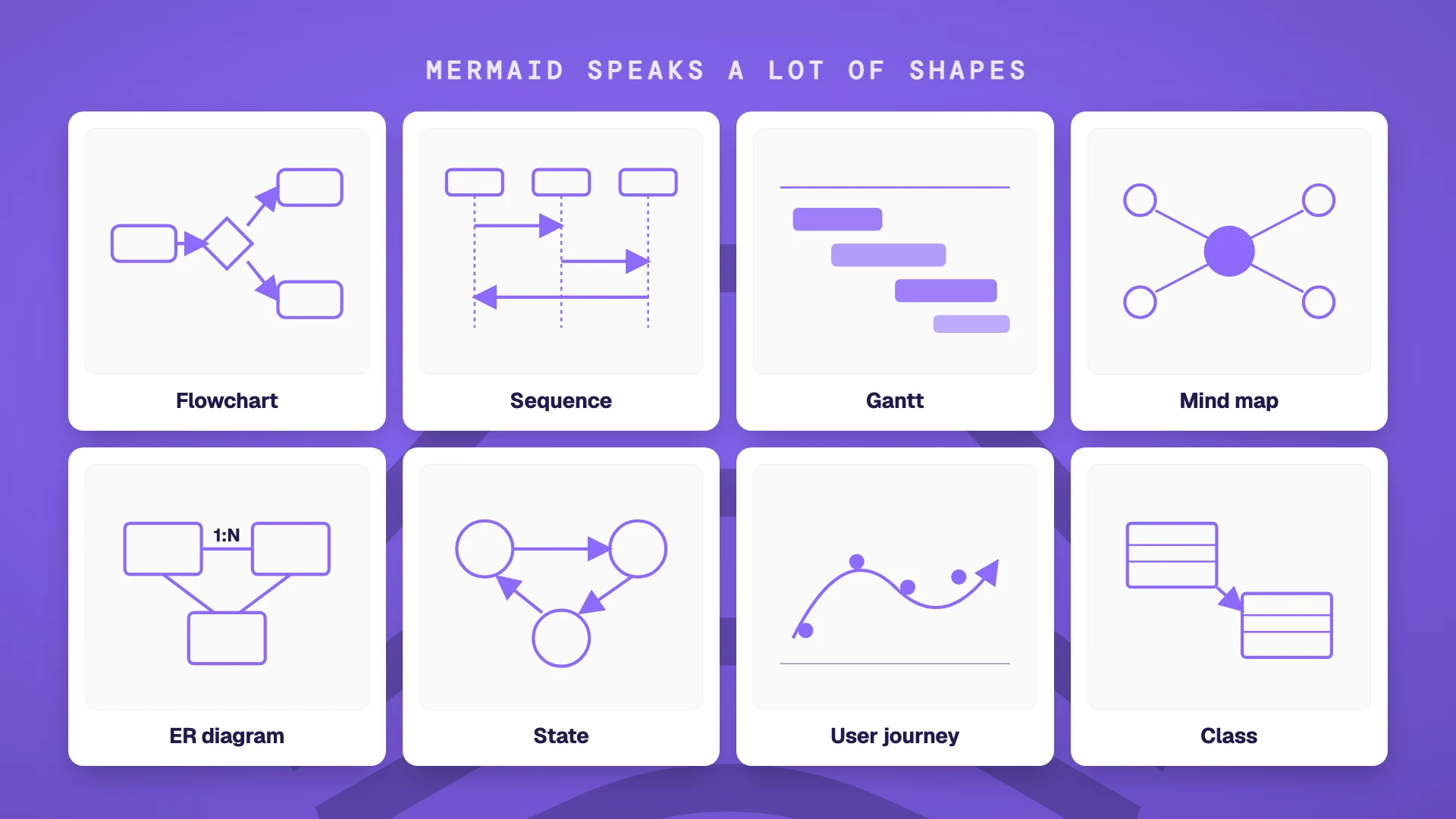
The advantage over a drag-and-drop tool like Miro or Lucidchart is that the diagram is just text. It versions cleanly in git. It pastes into any platform that supports Mermaid (GitHub, GitLab, Notion, Linear, Obsidian, Confluence, Slab, Logseq, and a growing list of others). You change one line of code and the diagram updates. And critically, a large language model can write Mermaid for you, which means you no longer need to learn the syntax to use it.
AI writes Mermaid for you
The reason Mermaid matters today is not the syntax. It is that you no longer need to learn the syntax.
Paste a meeting transcript into ChatGPT, Claude, or Cursor with the instruction "Draw this as a Mermaid flowchart" and you get back valid Mermaid code in a few seconds. Paste the code into a document that renders Mermaid, and the diagram appears. The skill barrier that kept diagrams confined to designers and consultants has dropped to "describe what you want."
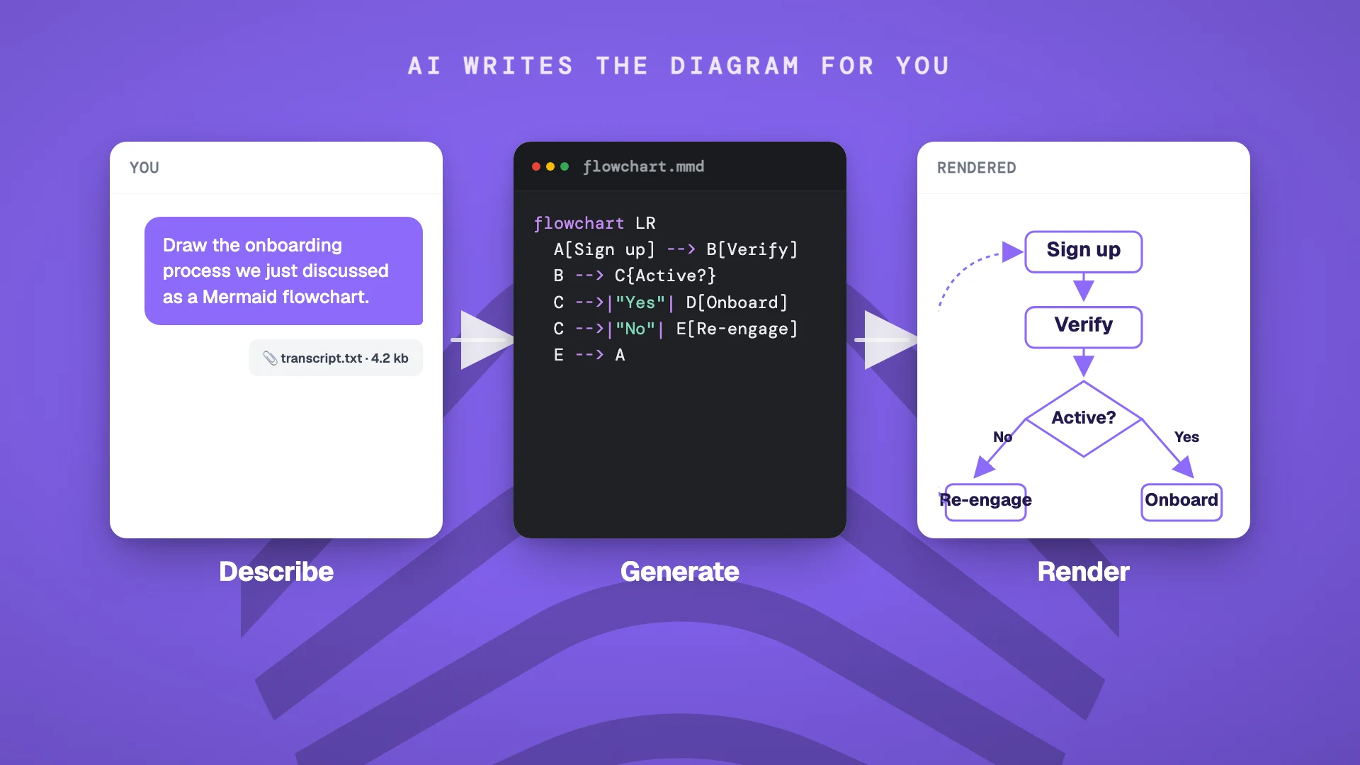
The catch: AI hallucinates. It will sometimes get the direction of an arrow wrong, mislabel a node, or skip a step the conversation only mentioned in passing. Always skim the diagram against the source material before publishing. A well-prompted model is right 80-90% of the time, which is good enough to save you most of the work and not good enough to skip the review.
So the workflow becomes: capture the conversation, prompt an AI, review and ship. Three steps. Neural Summary collapses them into one.
Neural Summary draws the diagram for you
Neural Summary's Process Map Lens takes a meeting recording and returns a Mermaid flowchart of the processes discussed, ready to embed wherever you publish. You do not write the prompt. You do not paste the transcript. You pick the Lens, and the flowchart shows up.
What you get specifically from Process Map:
- >The Mermaid flowchart itself, rendered inline in your dashboard
- >Each step classified as action (value-add work), decision (branching point), handoff (transfer between people or teams), wait (delay or queue), or terminus
- >Bottlenecks tagged by severity (high, medium, low) and explained in business terms
- >Improvement suggestions ranked by effort and impact, grouped by category (automation, data quality, integration, UX, compliance)
The diagram reflects what was actually said in the room, not your post-hoc reconstruction of it. The classification and bottleneck analysis is what an experienced process consultant would produce after listening to the recording twice, except it takes about 30 seconds and it does not bill by the hour.
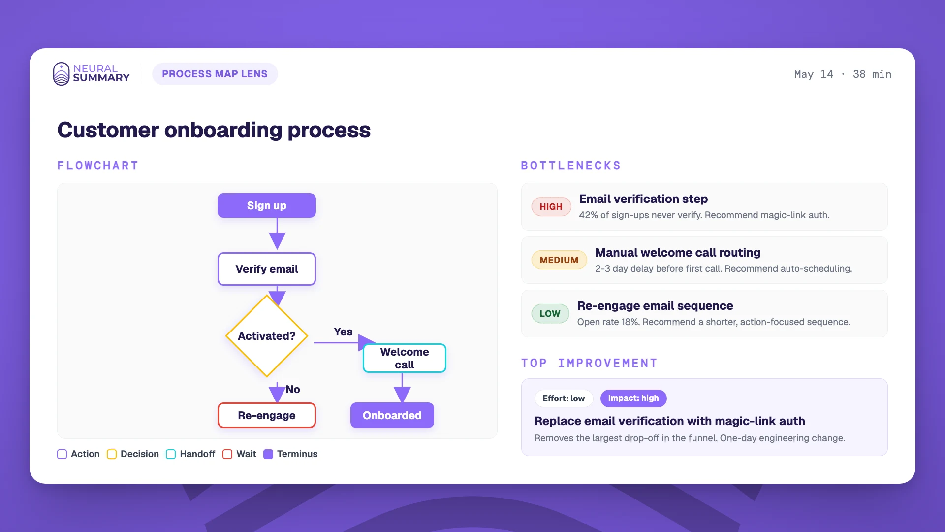
The diagram exports as Mermaid code, an image, or a copyable block you can paste into Notion, Confluence, Linear, or anywhere else your team reads. The bottleneck and improvement analysis travels with it.
Pick the right diagram for your meeting
Not every meeting wants a flowchart. The shape of the diagram should match the shape of the conversation.
| Meeting type | Best diagram | Why |
|---|---|---|
| Process discussion / product sync | Flowchart | Captures the step-by-step proposed process |
| Architecture review | Sequence diagram or ER diagram | Renders system interactions and data relationships |
| Sales discovery (multi-stakeholder) | Stakeholder map or decision tree | Shows who has influence and where the deal can break |
| Sprint planning | Dependency graph or Gantt | Shows what blocks what |
| Strategy session | Mind map or pyramid | Surfaces the hierarchy of decisions |
| 1:1 / coaching | Goal tree | Maps short-term actions to long-term outcomes |
| All-hands | Org map or timeline | Cascades who-does-what across teams |
For any of these, the same pattern applies: feed the transcript or a structured summary to an AI with a "Draw this as Mermaid" prompt, review the output, paste it where it renders. For process discussions, Neural Summary's Process Map Lens does the whole loop for you.
Don't write better notes
A diagram travels faster than a paragraph. It survives one more handoff before someone misreads it. It gets glanced at in the elevator, in the Slack preview, on a phone screen between meetings. The same content as text would have been skimmed once and forgotten by Friday.
If the goal is for the meeting to actually change something downstream, the output has to be the kind of thing the brain wants to receive.
Don't write better notes. Draw better pictures.


